
Seeing is believing: making the visual a part of your data culture
In the era of ever-increasing data volume, the importance of efficiently communicating it is growing. And that’s where data visualization steps in. As banks use an increasing volume of data, proper visualization will allow its best possible utilization, pointing to important details, which are not so obvious at first glance.
Make coordinates the backbone
The very first graphical representation of the data was, of course, the map, known to man for centuries. Descartes, who was the first to present mathematical operations using a two-dimensional coordinate system, can be considered a pioneer of data visualization. The actual “father” of graphical visualization is William, as he was the first to present data using lines, bars, and pie charts.
Why is visualizing data so effective? The canal capacity of vision is 10 times greater than that of touch and 100 times greater than that of hearing or smell. This is why the warning lights blink red, and the lowlands on the map are marked in green. Where instantaneous understanding of the message is important, colors and shapes outclass words.
The data below could have been rows and columns of numbers that would take a while to break through. This method of presentation will always lose to the split second needed to understand this neat graph:
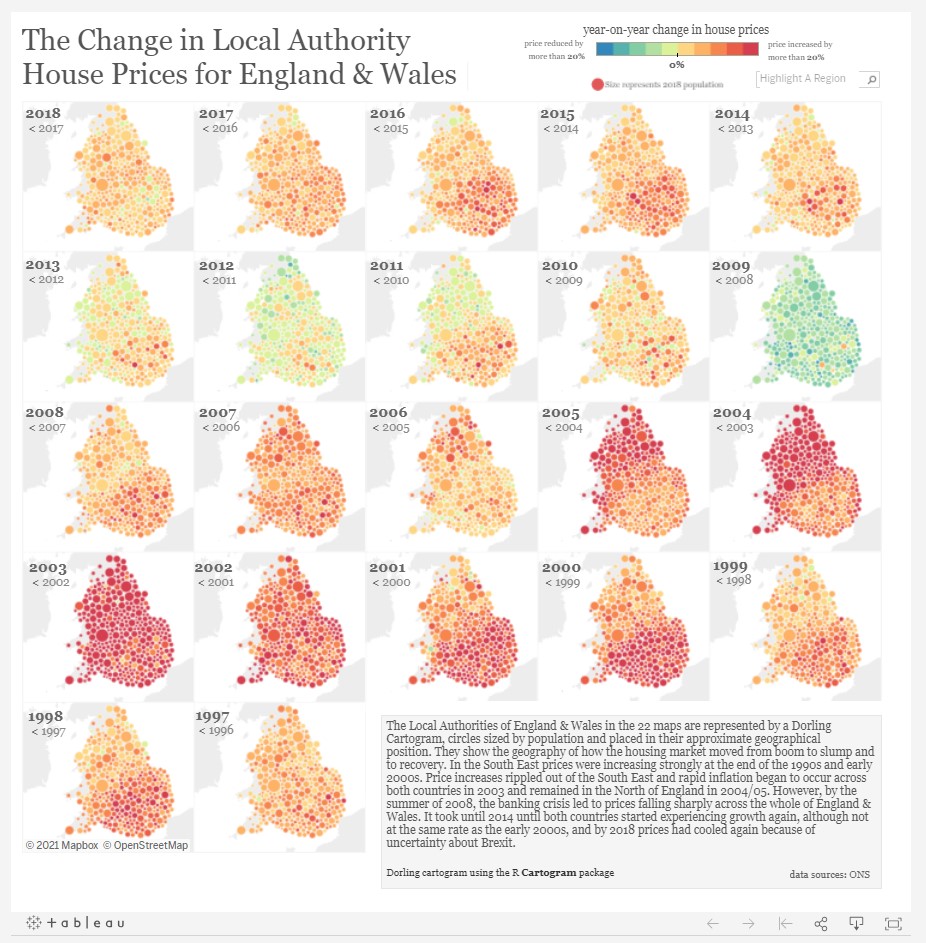
Author: Rob Radburn, Tableaux.
Today, the knowledge of data visualization is widely used in IT tools, including banking. But how exactly do they use colors and shapes to discuss data quickly and efficiently? Below are 4 ways to present your data with Tableaux.
Proportion works wonders
A consistent spatial reference system, with arranged elements makes it much easier to evaluate the presented data. The examples are the scatter plot and bar chart.
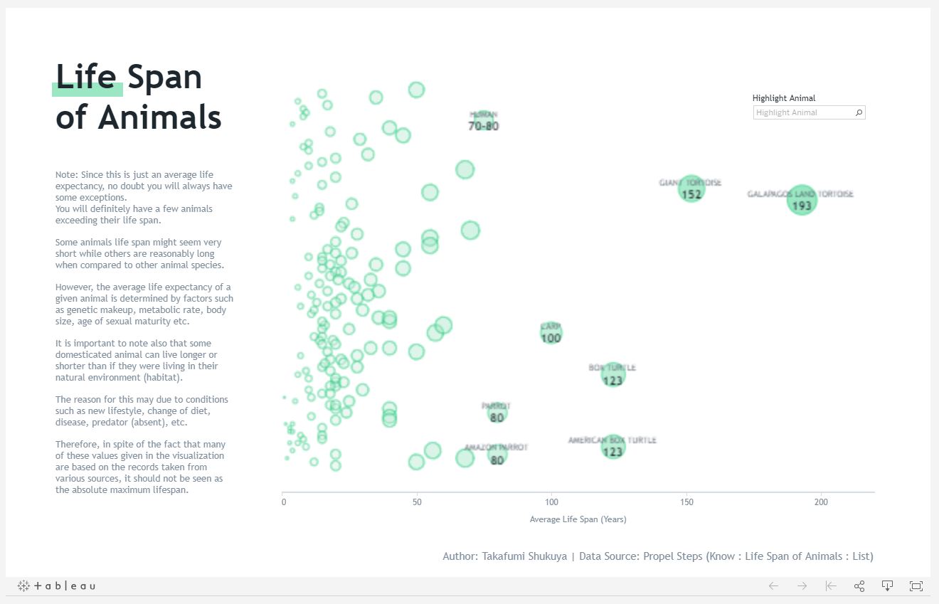
Author: Takafumi Shukuya, Tableau.
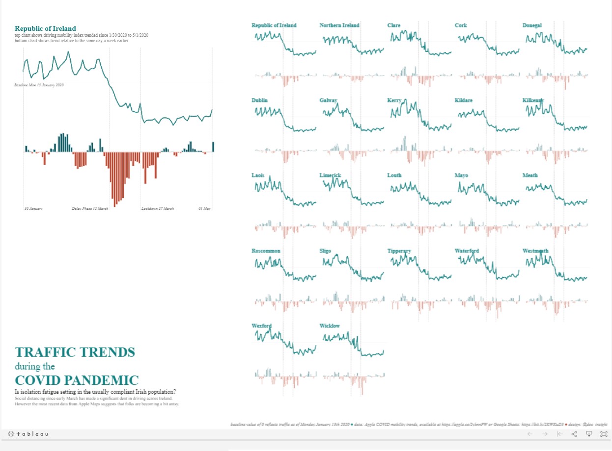
Author: David ó Cinnéide, Tableau.
Interestingly, even when the data sets differ from each other, presenting them against a consistent scale makes it much easier to understand, as it adds the “common denominator”.
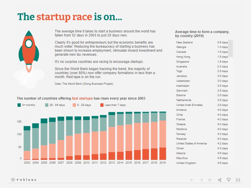
The bar: modest, yet mighty
Popular bar charts have several invaluable advantages. First, length can effectively represent quantitative information as it can scale to the value of the data it represents. The human brain can easily recognize proportions and estimate length even when objects are not aligned. The bars can also be set to point in a specific direction, easily recognizable by the human eye. For the presentation of data changing over time, you can use, e.g., line and trend charts.
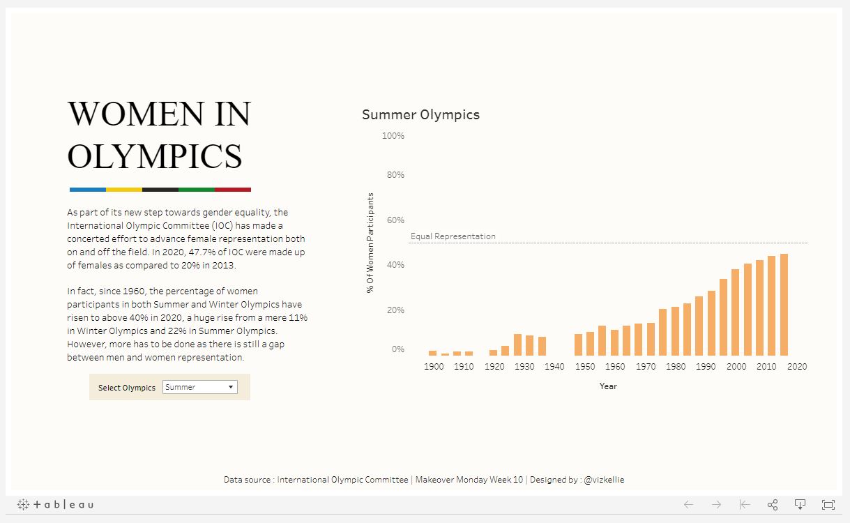
Author: Kelly Tan, Tableau.
An interesting twist to the “classic” bar is the third dimension. If the bars are nearly equal in two-dimensional representation, rendering them in 3D can improve reading precision.
The pie works to your advantage
Pie charts allow illustrating different values within one data set. They are perfect where you need to compare two congruent qualities. Angles help to make comparisons by providing a sense of proportion. Research shows that pie charts are just as effective as bar charts unless it includes more than three parts.
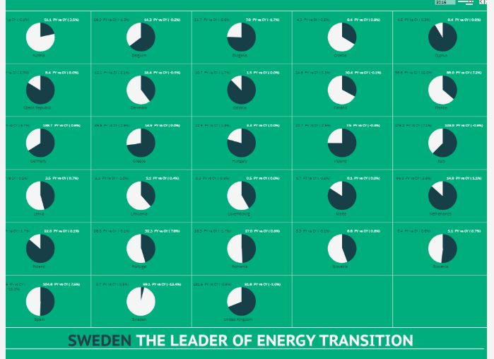
Author: Idris Akilapa, Tableau.
And speaking of round shapes, the bubble chart works great for presenting financial data. It acts as a scatter plot with additional information provided by the size of the bubble, which describes another variable.
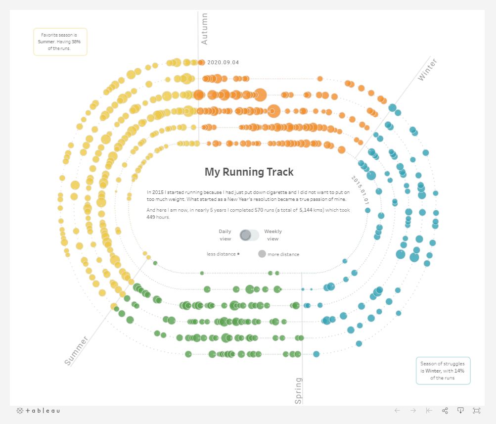
Author: Tamas Gaspar, Tableau.
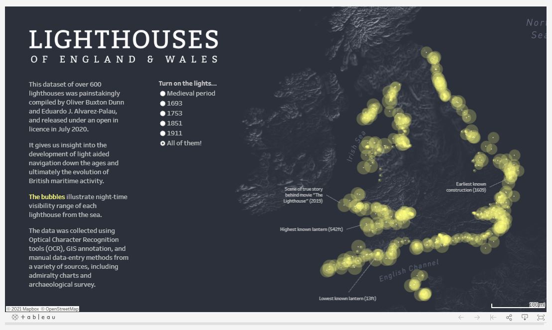
Author: Richard Speigal, Tableau.
The color tells a story
Color is not merely decoration. It works best when used sensibly and strategically. Color should help tell a story and communicate the purpose of the presented data set. Contrasting colors should only be used when there is a difference in meaning in the data, to reduce the cognitive burden. Color can also highlight the main elements of visualization. The increasing color intensity can be intuitively perceived as numbers with increasing value.
The lack of color does not make a good chart less effective. Gray is a good starting point for the ideation stage, but once your focal point has been identified, applying color will highlight these elements.
Author: Richard Speigal, Tableau.
Data visualization is an indispensable business tool
The renowned American mathematician and theoretical statistician, John Tukey said: “The greatest value of an image is when it forces us to notice what we never expected to see.”
Presenting data in a visual form accelerates your audience’s perception and helps reduce the cognitive load on their brains. No more muddy reports that your audience must wade through! Financial reports should, and can be understood at a glance and be used immediately, and conveniently. Thanks to data analytics and visualization, you can create even more added value, not only in the area of finance.
For us, data visualization is just a part of our development strategy. We believe that without proper presentation you can’t make the best of your data, and vice versa. Without an adequate solution that activates and utilizes data in real-time, even the neatest display is for naught.
This is why in the future, we plan to utilize the possibilities of Tableaux in our proprietary solution, Payres. in the meantime, we are open to any projects that include data analytics and visualization. Whether it is a massive spreadsheet that you want to make digestible, or just a handful of numbers, feel free to contact me, no strings attached.